Using Numeric Font Variants in Artwork
Sometimes, fonts have alternate characters that can be subbed in to give numbers a different style. This tutorial will show you how to use those alternate characters in your SignAgent templates.
For a bit of background information on numeric character variants, check out this article: Lining Figures

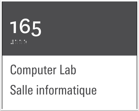
In the above piece of sign artwork, the Room Number field is being displayed in the National font. This font's numeric characters are, by default, not all the same height, and some have descenders that extend beyond the text's baseline (such as the character "5" in the image above).
This font has a number of variants that can be used to affect how those numeric characters are displayed.
In this example, we're going to be using "Lining Numbers". This means that all numeric characters will start at the baseline and extend to the full cap height.
Not all fonts have numeric variants, and some have more than others! Typically, Open Type Fonts are more likely to contain font variants.

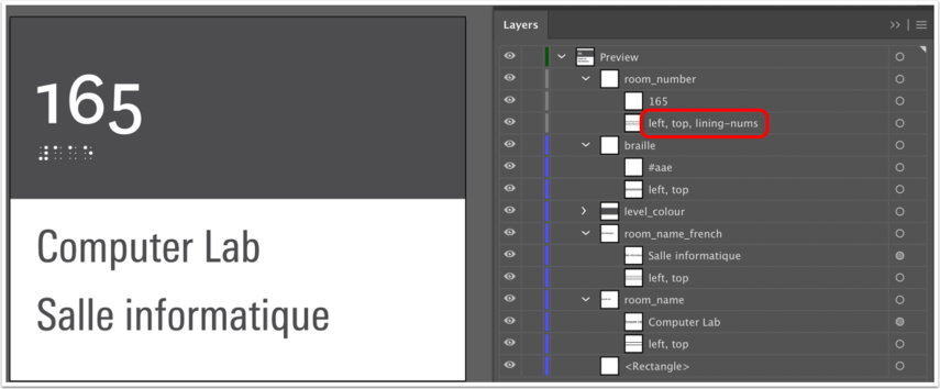
To activate the font variant "Lining Numbers", we add in the specifier of "lining-nums" into the bounding box's sub-layer.
And this lines up the heights of our numbers nicely, giving it a much more clean look. Below, you'll find a listing of numeric font variants that you can use within your SignAgent templates.
Ordinal
This will automatically superscript certain characters when using ordinal markers, such as 1st, 2nd, 3rd, 4th, etc.
To use this, add in the specifier of "ordinal" into the bounding box's sub-layer.
Slashed Zero
This does pretty much what it sounds like. It will add a slash to the zero character, to better differentiate between the number "0" and the letter "O"
To use this, add in the specifier of "slashed-zero" into the bounding box's sub-layer.
Old Style Numbers
This does pretty much the opposite of the Lining Numbers function. It will give certain numbers descenders that extend below the text's baseline
To use this, add in the specifier of "oldstyle-nums" into the bounding box's sub-layer.
Proportional Numbers
This set of figures has numeric characters which are not all the same width. This is usually the default, and is the natural look for most fonts.
To use this, add in the specifier of "proportional-nums" into the bounding box's sub-layer.
Tabular Numbers
This set of figures has numeric characters which are all the same width. This is helpful for aligning numeric values across multiple rows or in tables.
To use this, add in the specifier of "tabular-nums" into the bounding box's sub-layer.
Both "lining-nums" and "tabular-nums" commands need to be used for the text to display properly.
Diagonal Fractions
This set of figures will make both the numerator and denominator smaller and separated by a slash for fractions.
To use this, add in the specifier of "diagonal-fractions" into the bounding box's sub-layer.
Stacked Fractions
This set of figures will make both the numerator and denominator smaller, stacked, and separated by a horizontal line for fractions.
To use this, add in the specifier of "stacked-fractions" into the bounding box's sub-layer.